
Mixed USD Messages - Concurrent bull and bear market?
Mixed USD Messages - Concurrent bull and bear market?

Welcome to my Substack
These are long form notes im using to formalise my investment framework and explore the world of content creation. If what I have to say is interesting to you or your peers, please hit the subscribe or share. The content will always be free and I welcome criticism and discussion.
On a final note - these notes are written anonymously but in the case you decipher my identity, they represent my personal views and not those of my employer.
Let’s get into it.
The US Dollar is in a pretty interesting place. The general rhetoric is its ‘strong’ which is kind of true and kind of bullshit. People see what they want to see.
Let me show you
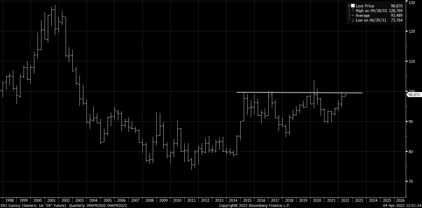
US Dollar Index with Carry - ‘big breakout coming’
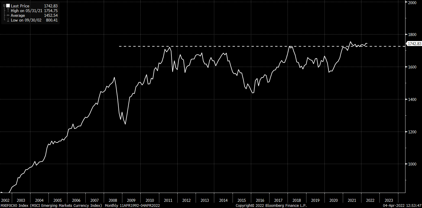
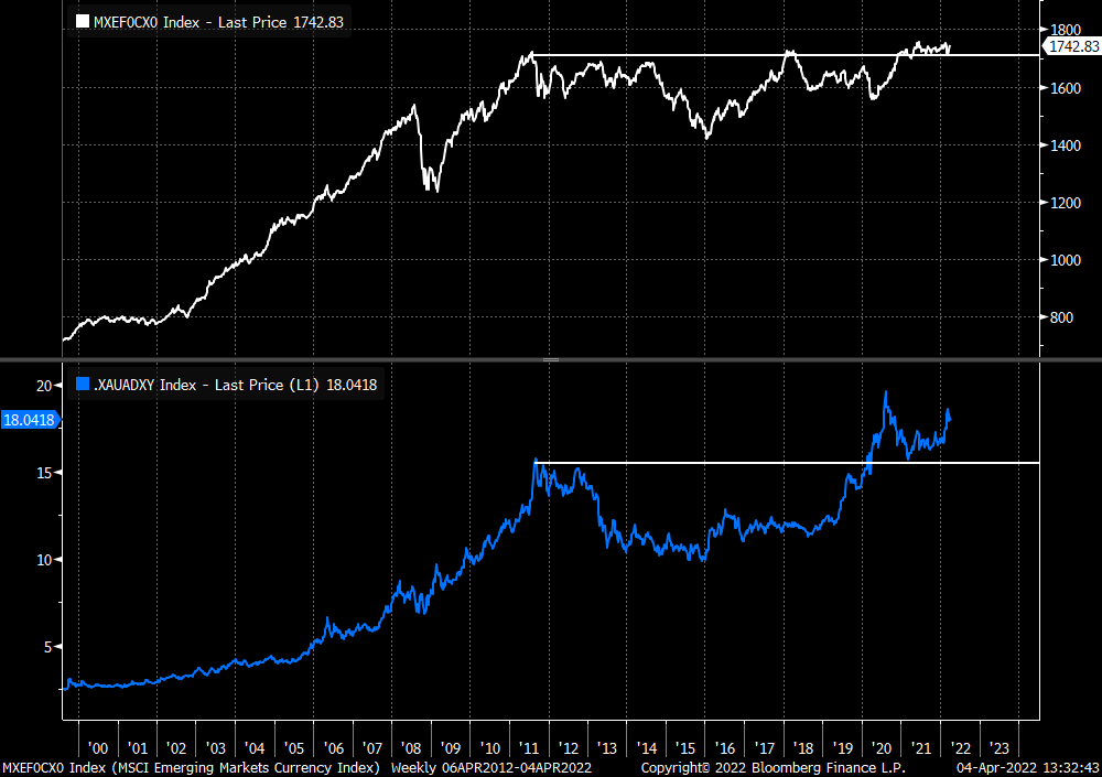
Emerging Currencies vs. USD with Carry - Secular breakdown in USD is happening
Most people think the DXY is the dollar - again this is narrative driven bullshit
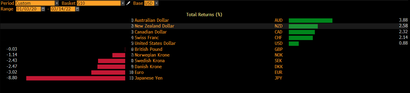
Since 2020 - total return of G10 has been split largely between those in NIRP and those without. CHF and NOK marginal exceptions.
Yet the index construction of the DXY creates a misleading picture.

Yes the USD has been appreciating against a basket with no interest rates, but it has also been falling against another basket with interest rates.
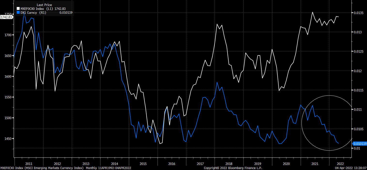
These baskets used to be a lot more correlated - if we use DXY vs. EM (both with carry) as an example.
White line = EM vs. USD with Carry
Blue Line = DXY (inverted) with Carry
What I find quite interesting is that the EM vs. USD with carry breakout is supported by a similar scenario in XAU/ADXY. Further details can be found in the below previous post.
Here is the two charts compared.
Other indicators that I use also tend to suggest that USD vs. DM could be a bit overcooked.
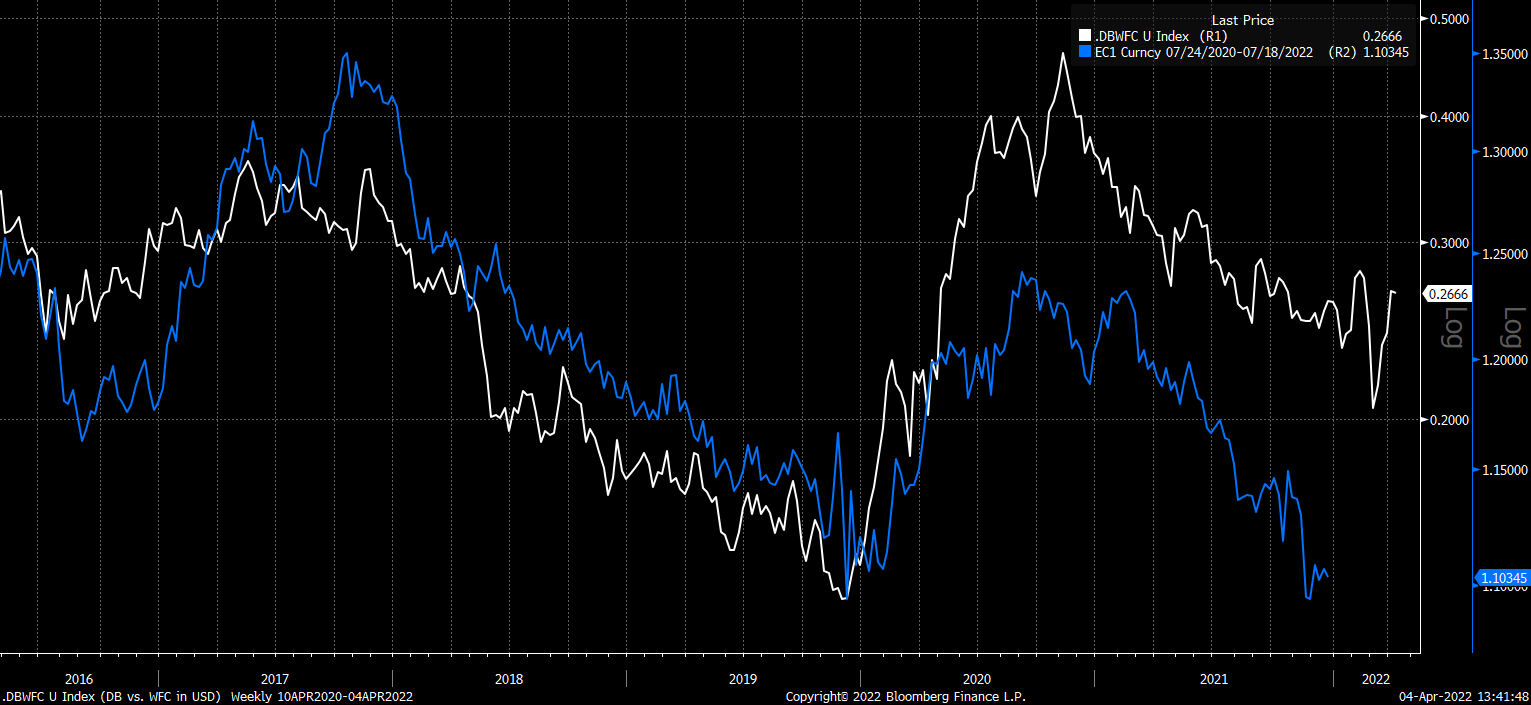
I have generally found that ratio of money center banks between Europe and US (both in USD) has been a pretty good lead for the path of EURUSD.
White line = DB vs. KBE in USD (90 days advanced)
Blue Line = EURUSD Carry Adjusted (hence the slight strange scaling)

Over these long periods the scaling gets a bit lost - if we shorten to the last 5y it is a lot clearer.

The same is happening if you sub out KBE for WFC
We can also see that US banks are starting to enter a period where they are significantly underperforming the broad US stock market and not benefiting from rising yields.
Blue Line = 10y UST yield
White Line = KBE/SPY
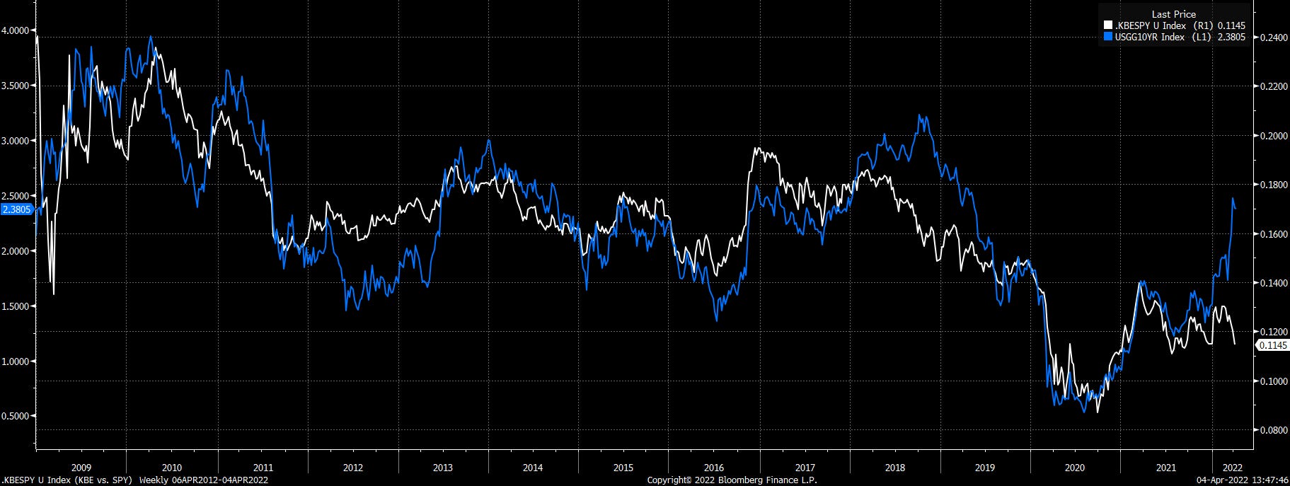
This would suggest that the relative banks ratio is unlikely to have any downwards pressure from US bank strength any time soon.
Whereas in Europe we see a money center bank (DB) very slowly outperforming its local stock market (DAX) - albeit quite feebly
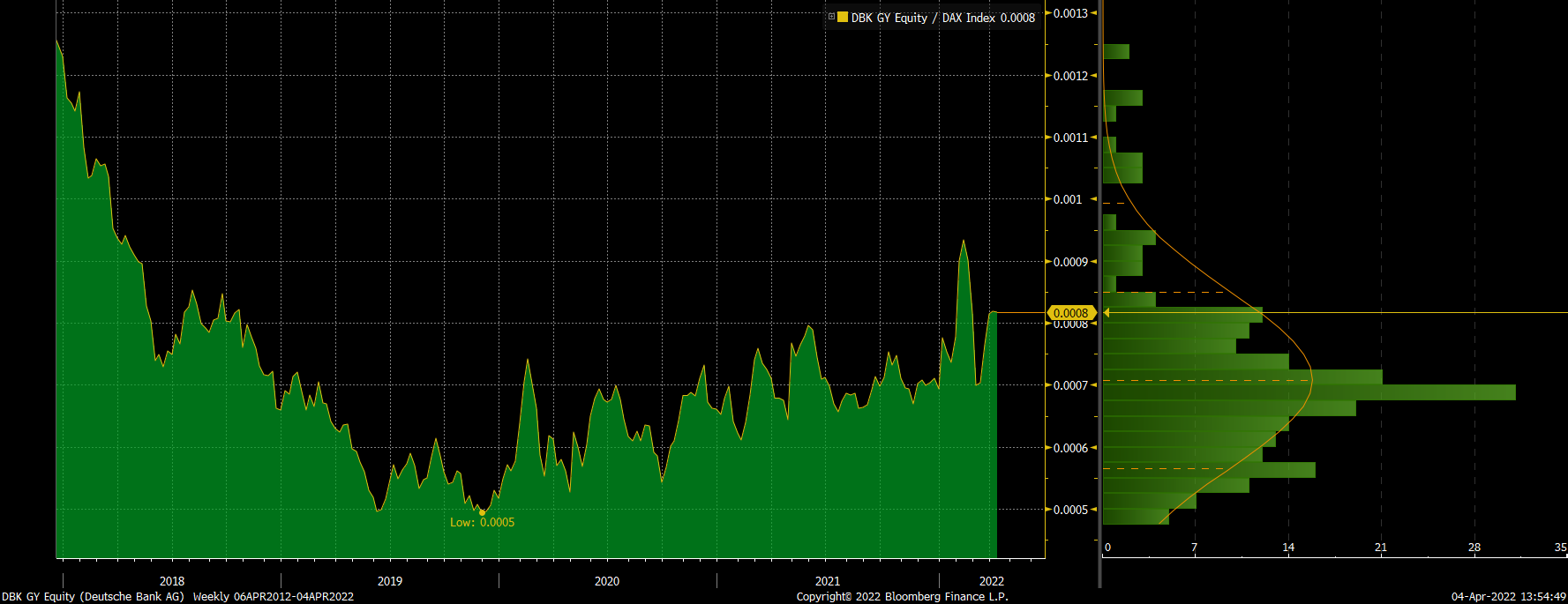
The ratio of European Banks to SX5E in total return space has also broken from a declining wedge

My expectations is therefore for the relative banks ratio to stay relatively stable or appreciate. If historical correlations are to be followed - this would suggest EURUSD will remain supported or will appreciate.
Other pairs are also quite intriguing.
Swiss franc futures (CHFUSD with carry) has been trading under a very tight downtrend line

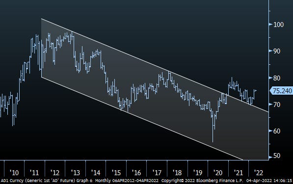
AUD futures (AUDUSD with carry) has been sitting above its downtrend for nearly a year
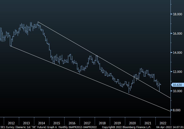
SEK futures (SEKUSD with carry) just had a violent reversal off of its long term downtrend
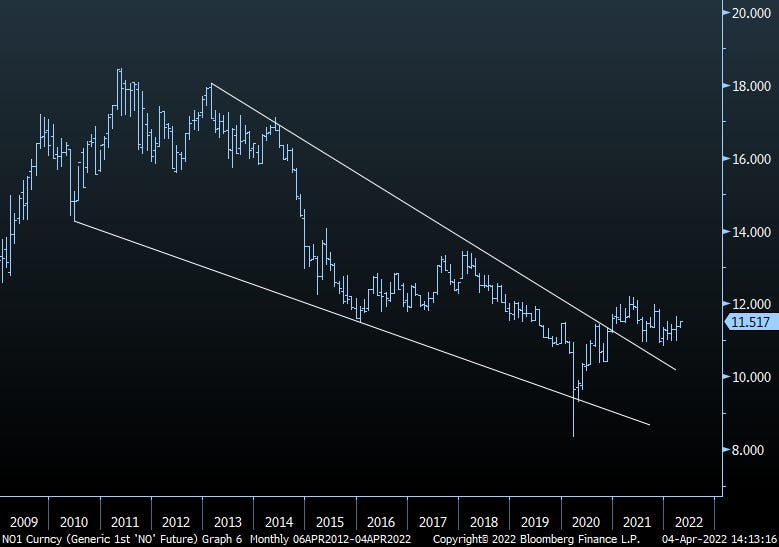
NOK futures (NOKUSD with carry) are also starting to turn up from their downtrend
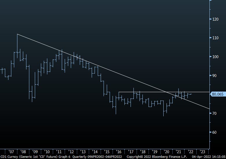
CAD futures (CADUSD with carry) has broken its downtrend but remains under quarterly closing high resistance from the last 6y
The final question really comes down to JPY. JPY is collapsing vs. everything - there are a number of theories why - i’ve outlined a few below:
As global yields are moving higher - the BOJ is now being forced to expand its balance sheet aggressively to defend its YCC policy
Inflation expectations are starting to become unanchored - as can be seen by the breakdown in TIPS vs. other leads like JNK
All major CBs are making hawkish policy tilts apart from BOJ
Japan is a large energy importer - recent price rises and price subsidies are leading to greater sell pressure on JPY for energy imports
I have no real edge when it comes to these theories. However what I can tell you is that for years I have watched the JPY TWI (White Line) track the ratio of Gold/Copper (Blue Line)
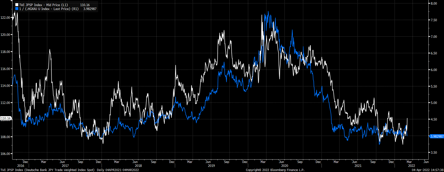
Needless to say - I cant even fit the scale of the decline of JPY TWI on the same chart anymore. Either the relationship has broken or JPY is seriously cheap

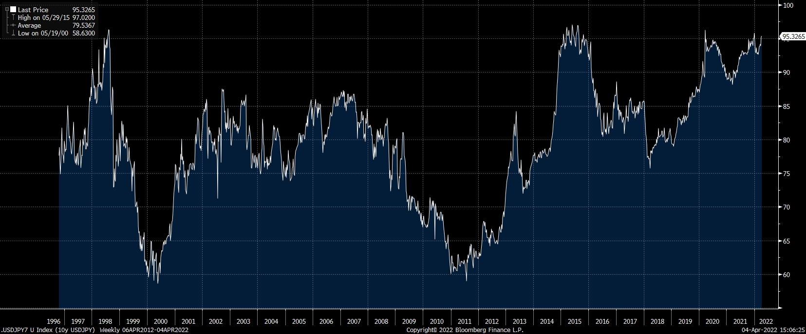
The 10y USDJPY Forward remains right at the top of its range for the last 25y - do we mean revert or head into unchartered territories
I like Europe - as I have explained in these two posts:
and..
So maybe i’m biased.
But this looks the real deal to me:
Good luck
Thanks for the post. Quick question: what BBG series do you use to construct the 10y USDJPY Forward you mention? Would love to recreate that and study. Thanks!