
Is Commodity/FX Correlation Breaking?
Is Commodity/FX Correlation Breaking?

Welcome to my Substack
These are long form notes im using to formalise my investment framework and explore the world of content creation. If what I have to say is interesting to you or your peers, please hit the subscribe or share. The content will always be free and I welcome criticism and discussion.
On a final note - these notes are written anonymously but in the case you decipher my identity, they represent my personal views and not those of my employer.
Let’s get into it.
This substack is called Correlation Capital for two reasons:
I needed something to call it
I use correlations to identify trends and opportunities in the markets
I have been working on a project internally at the HF where I work that looks to generate positive total return using options with an ESG overlay.
We built out a number of triggers to use as a checklist for the regime that we are in.
We came up with a signal that had historically captured the approximate turning points in commodity markets.
The signal was pretty simple: When the 18 month rate of change in Chinese New Manufacturing Orders breaks the 0 line after 3 previous quarters in the alternative direction - a regime change is occurring. This made sense as Chinese New Orders were the most forward looking data point that we receive about the manufacturing cycle.
An illustration of this is on the chart below.
The white histogram marks the 18m Rate of Change and the arrows show where the signal would have fired. The blue series at the top is the price of Lead on the LME
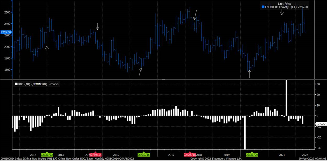
Against metals more broadly – you can see the signals had been relatively good until recently

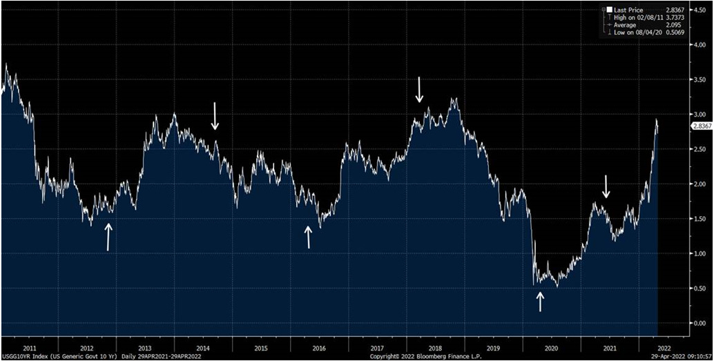
What is quite interesting is that other assets that are normally correlated to commodities have followed the historic pattern and some haven’t.
For instance – bond yields have traded through the signal like commodities on this instance
However USD hasn’t – below is a chart of Equal Weighted G10 Currencies vs. USD with Carry
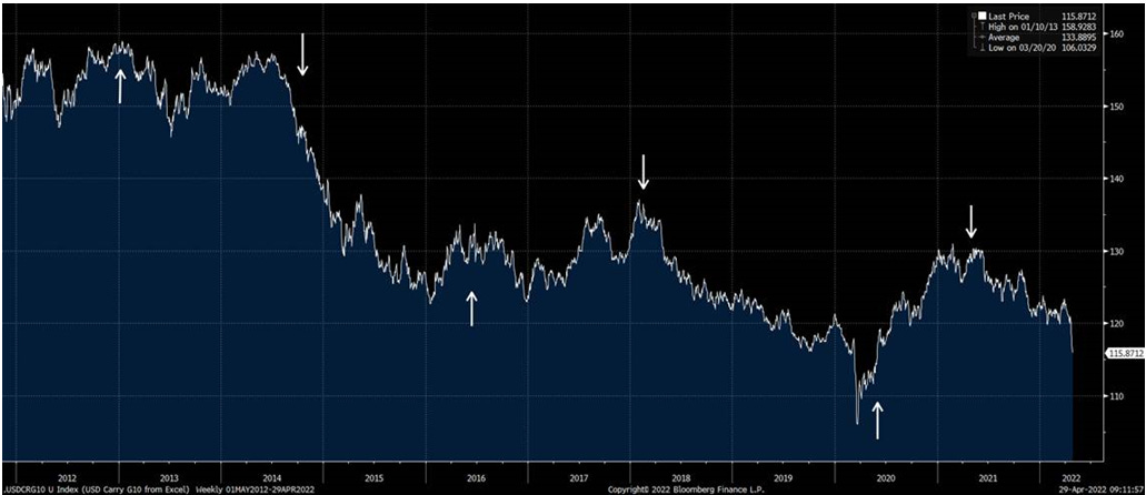
What we see are major divergences that historically have not occurred
If you look at G10 FX vs. USD with Carry (White Line) against Raw Commodities (Blue Line) you can see the scale of this divergence/break in correlation
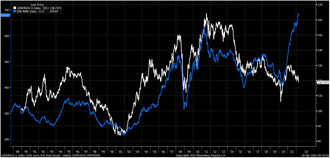
The only other period of material divergence seems to be the early 90’s where the break was in the opposite direction.
Equally over the same period – G10 FX vs. USD with has generally appreciated in a rising yield environment and fallen when bonds rally. This is no longer happening.
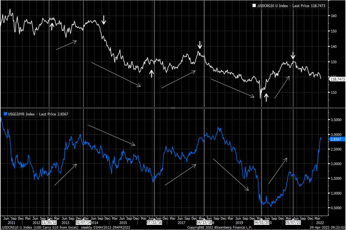
We have also seen this correlation break down within market internals. The ratio of Banks vs. SPX (White Line) are no Longer tracking 10y Yield (blue line)

This leaves us with a pretty strange market basis the last 10y of correlations.
The USD vs. G10 nominally looks like it’s about to break a 40 year channel
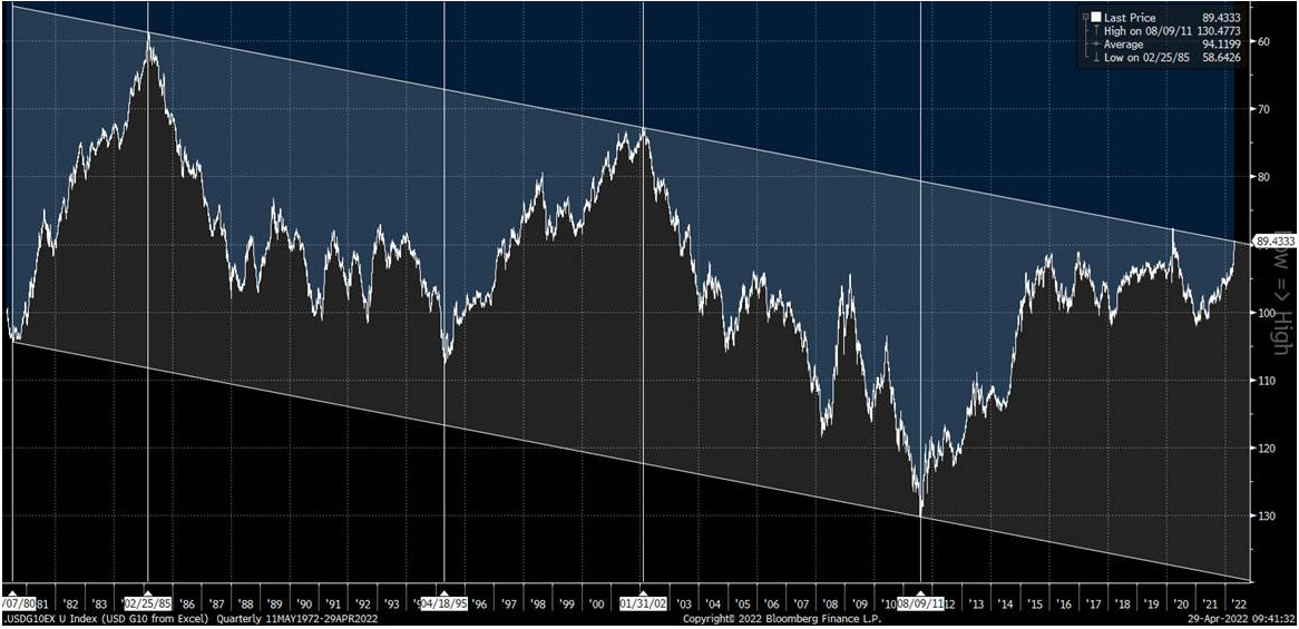
If we mark the same secular highs and lows on Commodities charts – the trends are inverse as you would expect. USD up Commodities down and vice versa. Until now.
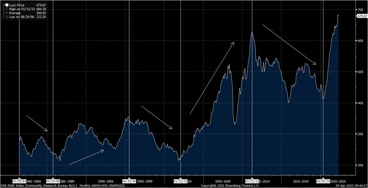
This makes the current regime particularly strange.
From a portfolio perspective – we can raise the following hypothesis’
1. Either USD or Commodities are materially mispriced and there is a significant VAR event in the making
2. We are entering a completely new regime than the last 40 years which will require vastly different portfolio theory.
Good Luck